36 free quilt blocks, one a week with a guide to Jane Austen's England and posts about the people in her life.

Sunday, March 30, 2014

Austen Illustration Sources

1809 Fashion Plate

Because blogging is such a visual medium I will be including lots of period illustrations over the next year. Here are some of the sources.

Period Illustrations from the Georgian Era

One great resource for an idealized view of Jane Austen's England is the fashion periodical of the era, particularly Ackermann's Repository, a London magazine published from 1809 to 1829. Fashion plates, then and now, are exaggerations of style and life. Do note that these Georgian-era fashion plates usually feature elongated bodies, setting up fashion ideals real human beings can never meet.

The Comforts of Bath by James Gillray (ca 1756-1815)

Another exaggerated but slyly accurate source is the caricature. Jane lived in a golden era for cartoonists who poked fun at society and politics.

Tours of Dr. Syntax by
Thomas Rowlandson  (1756-1827)

A Republican Beau
By Isaac Cruikshank (1756-1811) 
The Cruickshank family's sense of humor had a harsher edge.
Above a French Revolutionary.


Period Illustrations from Jane Austen's Novels

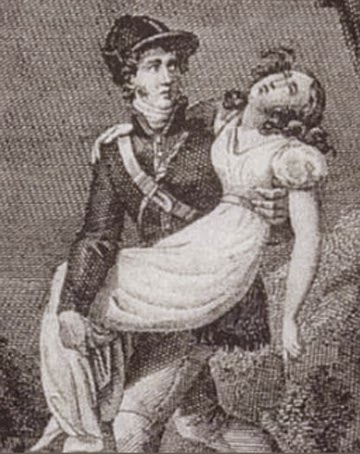
Willoughby saves Marianne by Charles-Abraham Chasselat (1782-1843) from
Raison et Sensibilitéa Paris edition of 1828.

Jane Austen's novels were not illustrated during her lifetime. The first illustrated editions are credited to French translations in 1828, followed by new English editions in 1833.

Illustration by William Greatbatch and George Pickering for Pride and Prejudice 
from the 1833 English edition.
Darcy and Lizzie in dress and hair fashion of the 1830s.

Sense & Sensibility 1899, illustrated by Chris Hammond.

By the '90s Jane Austen novels were a new craze as was the arts and crafts movement. Having lived through the age of the hoop skirt and the bustle, the illustrators looked back at Regency fashion with a touch of Victoriana and William Morris.

Cupid and Emma by Chris Hammond (1860-1900) Ms. Hammond's drawings appeared in the late 1890s.

Duets After Supper by
C. E. Brock (1870-1938)

Brothers Charles Edmund Brock and Henry Matthew Brock illustrated several books about 1900 in their distinctive styles.
Each volume had numerous plates colored by nostalgia.


"How do you like  my gown?" by H.M. Brock (1875-1960)


Reading Jane's Letters by Hugh Thomson (1860-1920)

Hugh Thomson worked in the early 20th century. As we can see by the furniture, his illustrations were period revivals.


Lizzie and Jane Bennet by Roberto Parada 
from Pride and Prejudice and Zombies

Because copyright extends back ninety years to about 1920 I will not be using more creative and current illustrations from new editions of the novels or new novels.

Period Illustrations from Early Biographies & Memoirs

Steventon by Julia LeFroy drawn from her mother 
Anna Austen LeFroy's memories.

About 1870 Jane's family began publishing recollections of her life. Illustrations of specific places in her world often originated in those family sources.

Chawton House by Ellen G. Hill

In the early 20th century sisters Constance and Ellen Hill toured those sites. Ellen painted and drew the buildings and landscape as they appeared a century later for Constance's 1923 book Jane Austen: Her Homes and Her Friends.

Read more about the history of the novels' illustrations in a chapter by David Gilson "Later Publishing History, with Illustrations" in Janet Todd's Jane Austen in Context. Here's a preview:

http://books.google.com/books?id=TVcNgW5uH5oC&pg=PA127&lpg=PA127&dq=illustration+george+pickering+austen&source=bl&ots=_dL9pTFvz5&sig=_cbj9_LzDHt9J-tWd4J0tSxoEQ4&hl=en&sa=X&ei=Kec2U9LnHNOxsATNiIH4CQ&ved=0CHkQ6AEwDw#v=onepage&q=illustration%20george%20pickering%20austen&f=false

Enough footnotes---Next Sunday the first block.

Sunday, March 23, 2014

The "Official" Set, a Simple Set & Yardage

Austen Family Album
36 blocks 12" square + alternate blocks
104" x 104"
Alternate Half-Square Triangles Set
Let's call this the Netherfield Set

I know that the model makers and you readers will go off on creative tangents with ideas for sets for the 36 sampler blocks. It's a project that will be growing for the rest of the year. It's organic, as Dustin says.

But I also know that some of you like to buy all your fabric ahead of time---the planners among you---so I have drawn up an "official" set in EQ7. It looks like a strip set but it's really blocks set on point. I'm naming these after fictional places in Pride & Prejudice.

Block Yardage
We'll start with the yardage for the 36 sampler blocks, each finishing to 12 inches. If you wanted to use just 5 fabrics I'd buy two yards of each. My theory is that it takes about 10 yards of fabric for a full-bed sized sampler so if you wanted to use 5 different fabrics:

10 divided by 5 = 2 yards each

3 fabrics?
10 divided by 3 = 3-1/3 yards each

10 fabrics for a scrappier look?
10 divided by 10 = 1 yard each

My formula may be too generous but don't forget I am in the fabric selling business.


1) Pieced Alternate Block Set (Netherfield)

I was inspired by Stitch & Knit's finished Grandmother's Choice sampler for 49 blocks:

Here's the plan for the Netherfield set above.
You need:
  • 36 Pieced blocks (the lightest blocks in the sketch) finishing to 12"
  • 25 Alternate half-square triangle blocks finishing to 12"
  • 4 Corner triangles (2 light and 2 dark)
  • 10 Edge triangles for the sides (5 light and 5 dark)
  • 10 Edge triangles for the top and bottom edges 


This is what those pieced triangles for the top and bottom edges look like.

Yardage:
EQ7 suggests 3-1/8 yards each of dark and light for the settings, but buy 3-1/2 yards each and you can use them in your scrappy blocks too.

Cutting:
Alternate Setting Blocks


The alternate blocks are all the same but rotated.

Cut 13 dark and 13 light squares 12-7/8". Cut each in half with a diagonal cut to make 2 triangles.

You need 25 light and 25 dark triangles.
Make 25 of these blocks.

4 Corner triangles
Cut 1 dark and 1 light square 9-3/8". Cut each in half with a diagonal cut to make 2 triangles.
You need 2 light and 2 dark triangles

Edge triangles for the sides
Cut 2 light and 2 dark squares 18-1/4". Cut each into 4 triangles with 2 cuts.
You need 5 of each of these unpieced triangles for the side edges. 

Pieced edge triangles for the top and bottom


10 Edge triangles for the top and bottom edges 
Cut 5 dark and 5 light squares 13-1/4". Cut each in half with a diagonal cut to make 2 triangles.

You need 10 of the dark and 10 of the light triangles.
Piece these together to make half square triangles (these are larger than the alternate blocks.)


Turn them on point and cut them in half with one cut.
You need ten of these pieced triangles.

You set the blocks diagonally

2) Sashing & Cornerstones Set (Meryton)


Now if this looks all too complicated you can always use a simple, sashed set.

Set with Sashing and Border
96-1/2" x 96 1/2"
We'll call this the Meryton set.

Here's the plan for the whole set above.
You need
  • 36 Pieced blocks finishing to 12" x 12"
  • 25 Cornerstone squares to set between the blocks, finishing to 2-1/2" x 2-1/2"
  • 60 Sashing Strips to frame the blocks, finishing to 2-1/2" x 12" rectangles.
  • A single border finishing to 6" wide.
Yardage:
EQ7 suggests:
3/8 yard for the cornerstones
1-3/4 yards for the sashing strips
Border: If you use a large chintz you will want to cut the borders as single strips and not piece them, so buy 2-3/4 yards. You may also want to use the same print as in the sashing strips.

Cutting:
Cut 25 cornerstone squares 3" x 3".
Cut 60 Sashing Strips as rectangles 3" x 12-1/2".

Borders:

Mitered border corners: Cut 4 strips 6-1/2" x 97.
OR
Right angle border corners:
Side Borders: Cut 2 strips 6-1/2" by 85"
Top & Bottom Borders: Cut 2 strips 6-1/2" x 97"

More on the Netherfield Set at the top of the page:


Becky drew some more ideas in EQ7: She says:
 "I played with it a little to make it symmetrical and also another version to make it a little smaller."

The Symmetrical Set (Longbourne)

This is the Netherfield set with the alternate blocks
rotated in different ways to make a balanced grid
for 36 blocks. It's cut just the same and finishes to 104" square.

Here's an antique quilt with the same set for 42 blocks.

A Set for 30 Blocks (Pemberley)

It's an idea.


Sunday, March 16, 2014

Other Color Ideas for an Austen Family Album


Austen Family patchwork in the collection
of the Jane Austen's House Museum at Chawton. 
Photos by Bettina Havig


 The center of the Austen diamond patchwork uses several chintzes, particularly some with a light to medium tan background called a tea ground at the time. One could use this period color scheme for the Austen Family Album blocks.

Read a post I wrote about the Austen patchwork here:

This second Georgian-era color idea focuses on deeper, richer colors than the pale pinks, blues and purples in last week's post. 


Chintzes with densely colored grounds were relatively new
in the early 19th-century.


Details from some online auctions.

Exotic birds and trees (arborescent prints) were a
fad in Jane Austen's time and you can see
scraps from these in the Austen patchwork's diamond center.

This piece with a panel of an actress mixes dark chintzes with spotted muslins---
 these are NOT the coarse muslin we're familiar with but a print on a higher grade of cotton weave.

A similar dark and light color scheme with
a panel picturing Caroline Princess of Wales,
the Regent's wife

Although you see blues, lilacs and pinks here, more dark brown and red prints make a higher contrast. 

The palette of darks and lights was also
popular in America.


For this scrapbag you'll need reproduction chintz-scale prints. 
I did a collection called Lately Arrived From London
few years ago in the American taste for English prints.


Look for lights and darks like these.


You can probably still find some Lately Arrived From London
online.


Becky Brown is going to do two sets of Austen Family Album blocks each week.


One will be in blues/tans and ivories.
She'll be using many reproduction prints so it will
have a period look combined with a 21st century update.

She'll also be sewing a set on the red side of the color wheel with some olive green and dark blues. The prints are from the new Ladies' Album reproduction collection I've done for Moda. The theme here is mid- to late-19th century but the colors didn't change too much from 1805 to 1890.

Yardage is in quilt shops now: April, 2014.

Read more about chintzes here
http://barbarabrackman.blogspot.com/2011/08/every-early-repro-collection-needs.html

And you can make your blocks in totally contemporary fabrics and color schemes too....

....Like Pip at Rest is Not Idleness
who is doing the Civil War era blocks
Threads of Memory in totally 21st century prints.

For more period prints see:

Moda's Collection for a Cause: Warmth
And the Mill Book Series. The new line is Collection: Mill Book Circa 1852

Sunday, March 9, 2014

Regency Era Color: Idea #1

Detail, the 1797 Sundial Quilt from
the collection of the Victoria and Albert Museum
One of the few block samplers from the era.

The color above seems typical of Gerorgian/Regency quilts. 
See the bottom of the post for links to more pictures.

We've been working on the blocks for the Austen Family Album---mainly thinking about color and fabric. Becky, Dustin, Georgann and Bettina are making model blocks.

The block post start on April 6 but you will want to be thinking about fabric.

Detail, the King George III Reviewing the Troops quilt from
the collection of the Victoria and Albert Museum

We are making a 21st-century quilt but my thinking on color at this point is, naturally, "1800 England." There were a few popular color palettes for patchwork at the time.

Detail of the quilt known as the Jane Pizar quilt

The first look is a combination of light muslins ---either white or ivory---print or plain---with chocolate browns and pastel pinks, blues and lilacs. It's a light palette with the madder browns for contrast.

The lightest prints were often called Spotted Muslin.

From Barbara Johnson's fabric album in the collection of the 
Victoria and Albert Museum:


See a post I did about Spots here:
http://quilt1812warandpiecing.blogspot.com/2012_07_01_archive.html

 King George III Golden Jubilee Quilt, 1810, 
collection of the Victoria and Albert Museum

The blues tend to be bright mediums and lights rather than the navy blues also produced with indigo dyes.

As for the pinks---there is a wide range. It's really an
absence of true reds that defines this palette.

You also see the palette in quilts found in the U.S.:

Mosaic quilt attributed to Catherine Brobst or Fanny S. B. Jungman,
 Pennsylvania. Collection of the Winterthur Museum.
Curators attribute the fabric to England between about 1770 and 1815.

Detail of an English quilt in the collection of 
the Metropolitan Museum of Art.


For more pictures of English patchwork see Penny Tucker's Pinterest Page
http://www.pinterest.com/penelopetucker/antique-english-patchwork/

Several years ago I designed a Regency reproduction
line for Moda called Hartfield


Do a web search for the words Hartfield Moda and 
you'll find shops and online sellers who still have some
yardage and precut packages.

Next Sunday: more color ideas.

Links to see more of the quilts:

The 1797 Sundial quilt:
http://collections.vam.ac.uk/item/O14716/patchwork-quilt-unknown/

See a post about King George III Reviewing the Troops at the Queensland Art Museum blog:
http://blog.qag.qld.gov.au/popular-prints-and-patchwork-in-18th-19th-century-britain/

More on the Jane Pizar quilt:
http://barbarabrackman.blogspot.com/2012/03/jane-pizar-quilt-how-old.html

An online article about the King George III Jubilee quilt:
http://www.vam.ac.uk/content/journals/research-journal/issue-03/x-radiography-as-a-tool-to-examine-the-making-and-remaking-of-historic-quilts/

The Winterthur's hexagon quilt:
http://museumcollection.winterthur.org/single-record.php?resultsperpage=60&view=catalog&srchtype=advanced&hasImage=&ObjObjectName=&CreOrigin=Pittsburgh&Earliest=&Latest=&CreCreatorLocal_tab=&materialsearch=&ObjObjectID=&ObjCategory=&DesMaterial_tab=&DesTechnique_tab=&AccCreditLineLocal=&CreMarkSignature=&recid=1967.0031&srchfld=&srchtxt=&id=8a16&rownum=1&version=100&src=results-imagelink#.UxNdNtiYZYc

And the Metropolitan Museum's British quilt
http://www.metmuseum.org/collections/search-the-collections/229936?rpp=20&pg=2&ao=on&ft=patchwork&img=2

See Barbara Johnson's fabric album at the Victoria and Albert Museum:
http://collections.vam.ac.uk/item/O140029/album-unknown/